Exploring the Evolution of Suncombe Logos: A Design Journey Through Time

The Suncombe organisation, founded in 1961, has been in business for over 60 years and in that time, we have undergone a number of logo changes. Each logo reflects the company’s changing values and goals over time.
Our founder started the company, to further develop the technology of Cleaning In Place and to introduce the new technology of Cleaning In Place to new companies, new applications and new sectors. The first Suncombe logo was created in 1961. It was a simple, block capital design of the company name’s first letter ‘S’ stylised in a 1960s techno manner, to symbolise the technological advances that our company was embarking on.

This logo was used for over 30 years and came to be seen as a symbol of robust reliable, high quality equipment and systems.
In the 1990s an innovative precision engineering company, LT Engineering, previously run by Steve Overton, was amalgamated into the Suncombe organisation to incorporate their knowledge of detailed engineering and new precision techniques and to further develop and refine the Suncombe product ranges.
In the 1990s, Suncombe began to focus on new markets and technologies. New technology products were developed including Biowaste Decontamination Systems, that required the full critical processing knowledge of the Suncombe organisation. Cabinet Washers were also introduced to provide a method for washing process equipment. USP Water storage skids and solution preparation systems were developed. To reflect this change, they created a new logo that was more modern and dynamic. This logo featured a faded triangle, highlighting our company name with a new tag line of “Engineering Excellence”.

In the 2000s a niche cleaning company, CIProcess, previously run by Dave Adams Overton, was amalgamated into the Suncombe organisation to incorporate their knowledge of niche cleaning and innovative processing and engineering systems, to further develop and refine the Suncombe product ranges.

The 2000s saw Suncombe continue to grow and expand. Our Cleaning In Place, Biowaste Decontamination Systems and GMPWashers were continuously developed to incorporate changes in the Automation, control and instrumentation areas. Cabinet Washers were further developed into GMPWashers to provide a validated GMP method for washing process equipment. We also began to focus on sustainability and environmental responsibility. To reflect these values, we created a new logo that was simple, yet powerful. This logo featured a
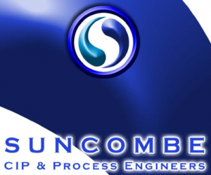
The current Suncombe logo was initially created in 2000. It was initially based around a 3 dimensional water droplet design, with opposing blue colours.

Over the past decades, this logo has been altered to a more simple, yet elegant design that reflects the company’s commitment to quality, innovation, and sustainability. The logo features a blue circle with a white wavy line running through the centre. The circle is meant to represent the globe, demonstrating our commitment to worldwide sustainability and also purporting to be water droplets, with the company name and new tag line in a modern font.

Each of Suncombe’s logos has its own unique story to tell. Together, they tell the story of a company that has been committed to quality, innovation, and sustainability for over 60 years.

